
OVERVIEW
Identity redesign for the largest plant-based festival in the Midwest.
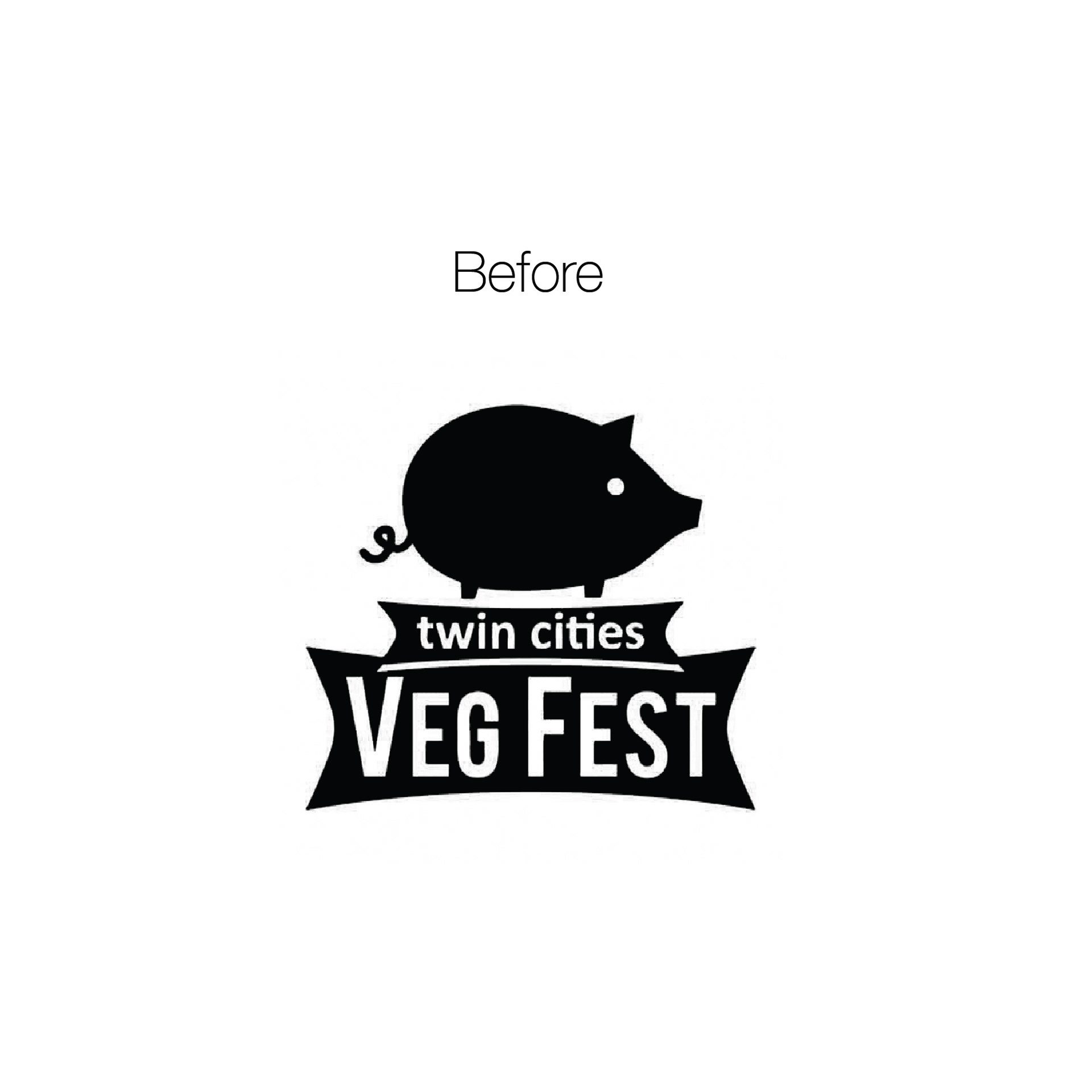
The Twin Cities Veg Fest celebrates food and fun for vegans and non-vegans seeking to explore delightful plant-based foods. That messaging lost its meaning due to confusion caused by a pig as logo iconography. Oddly, people thought the event was for pig roasting. Can you believe it?
SERVICES PROVIDED
Strategy
Creative Direction
Identity & Collateral Design
THE PROCESS
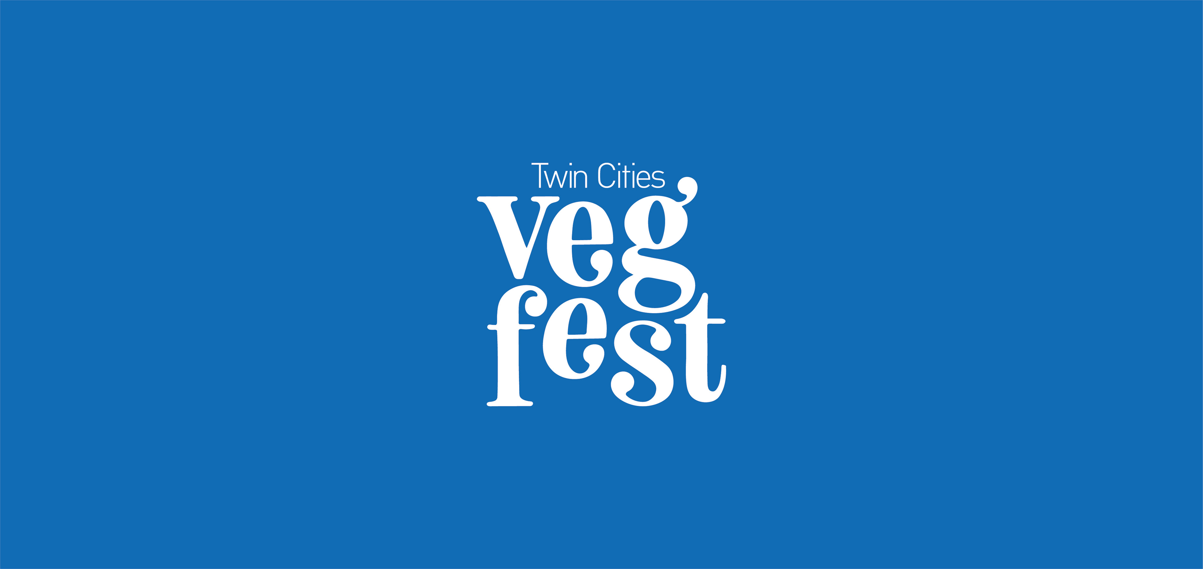
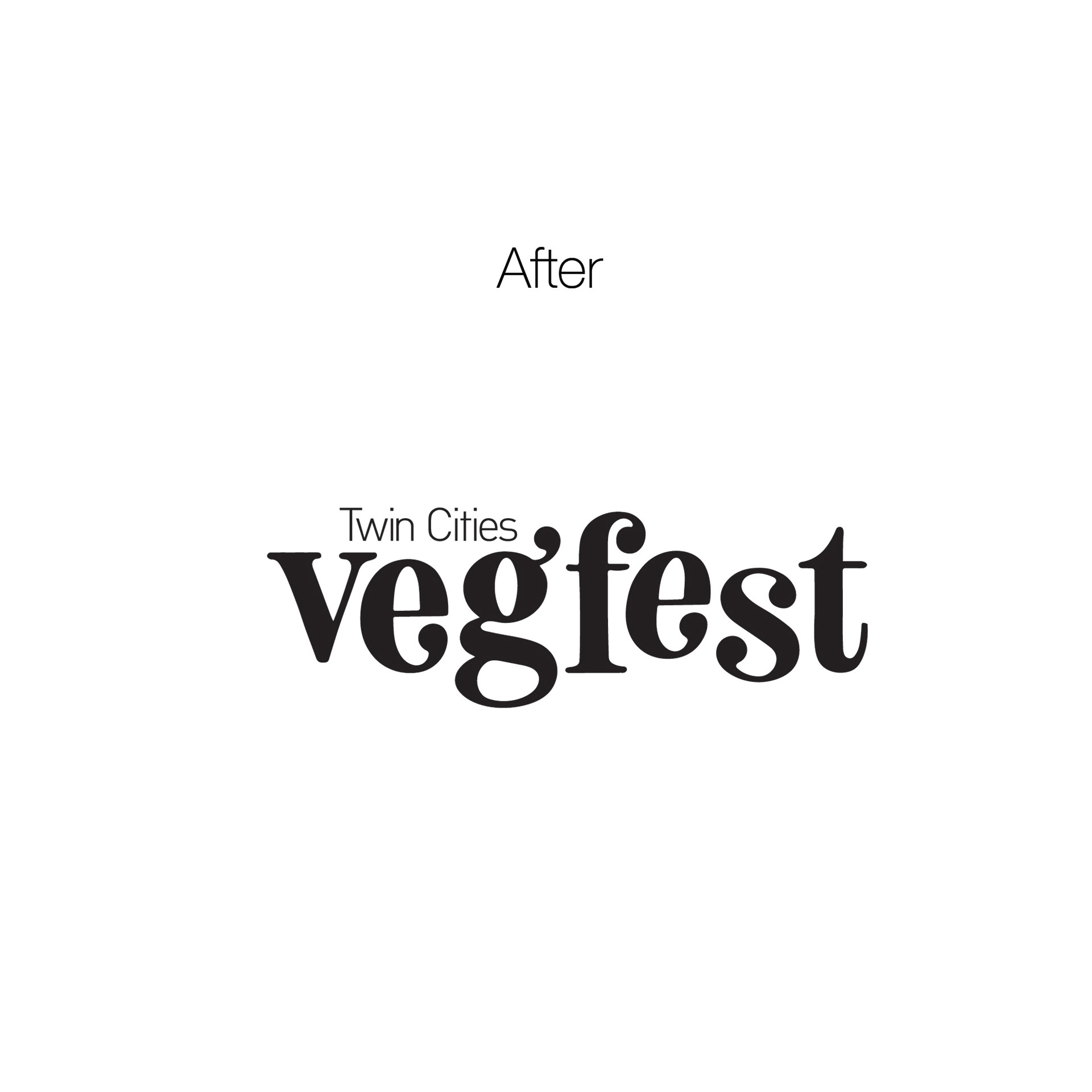
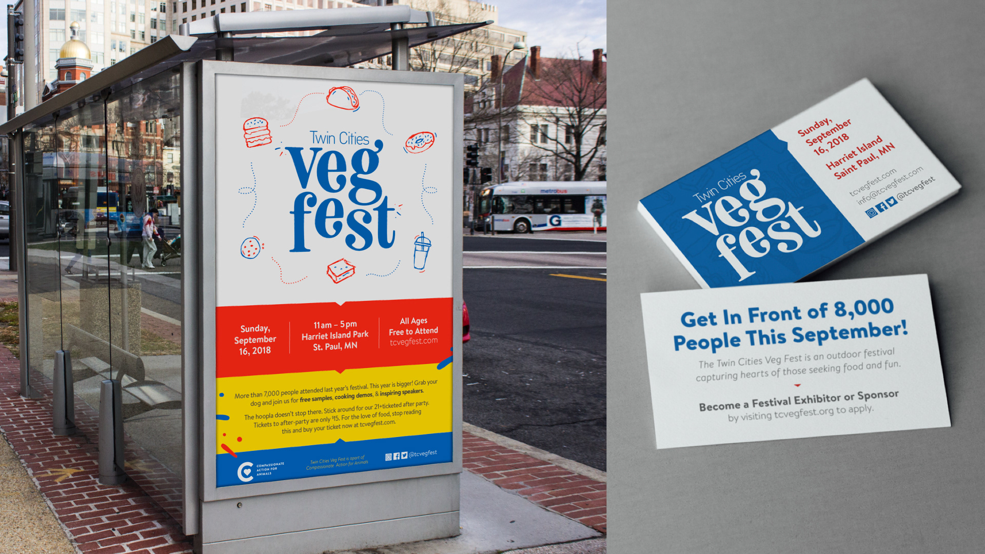
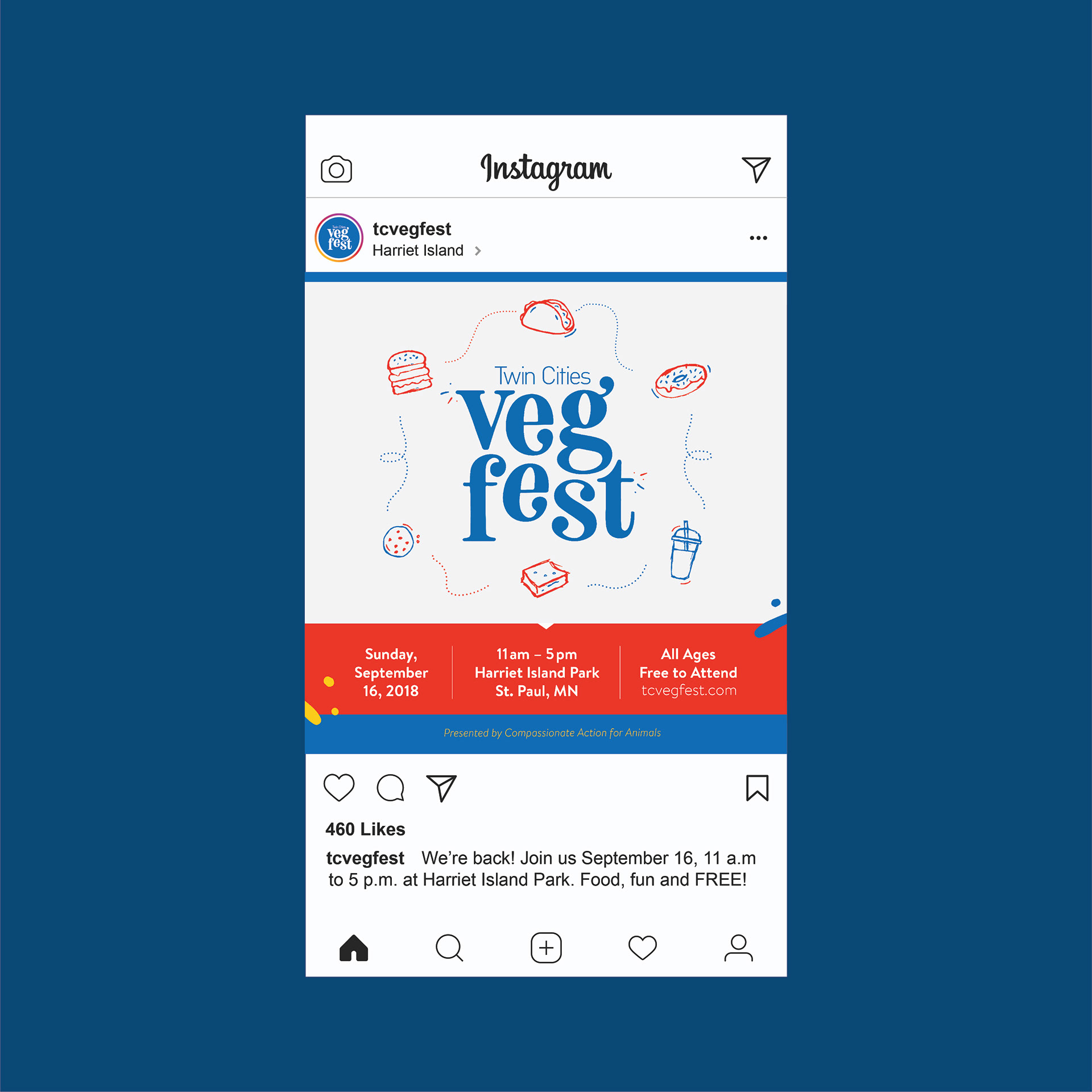
Keeping things fun, dynamic, and food-focused.
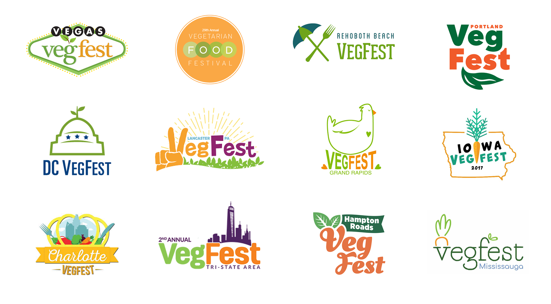
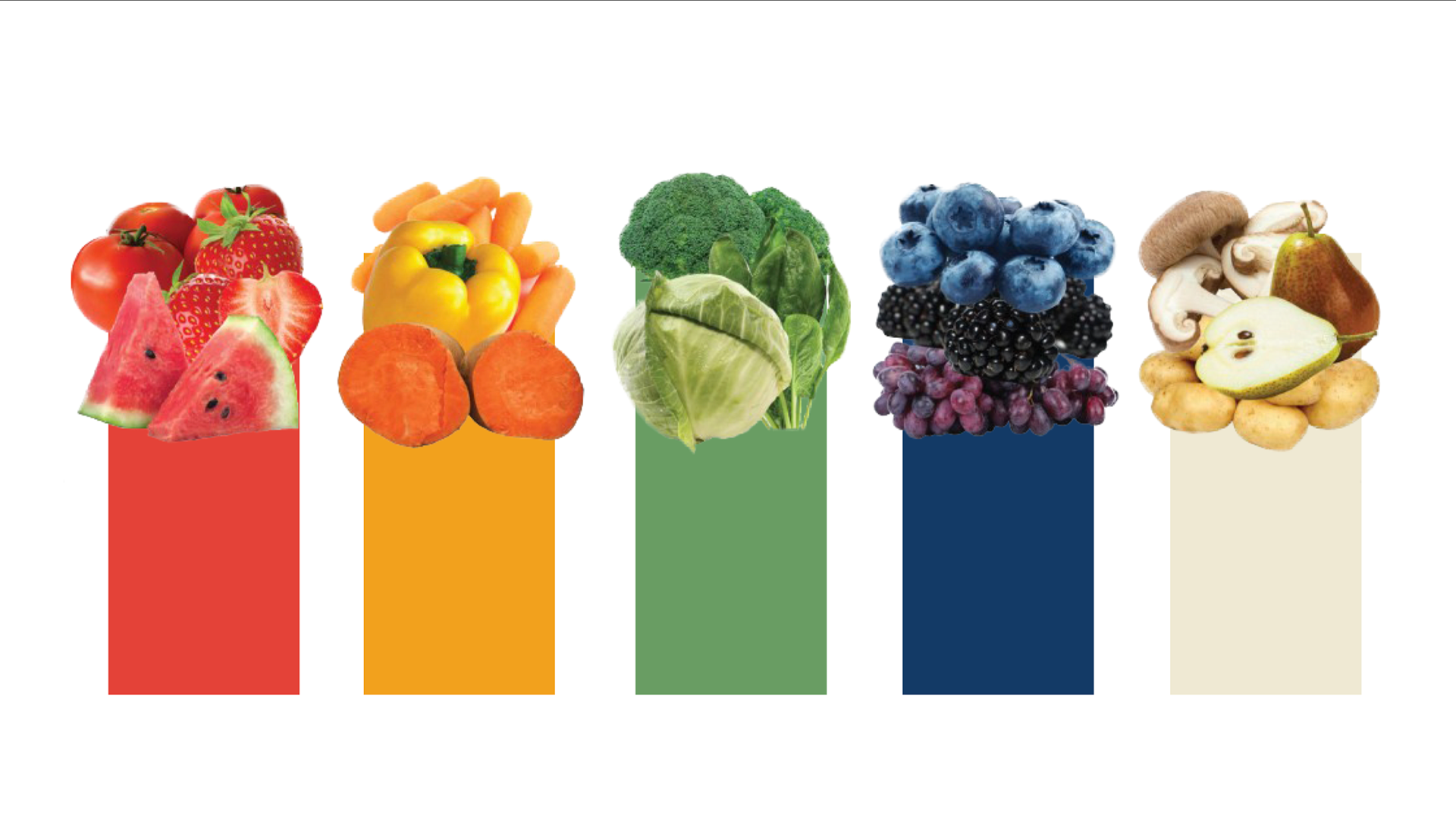
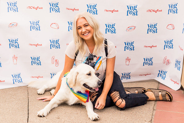
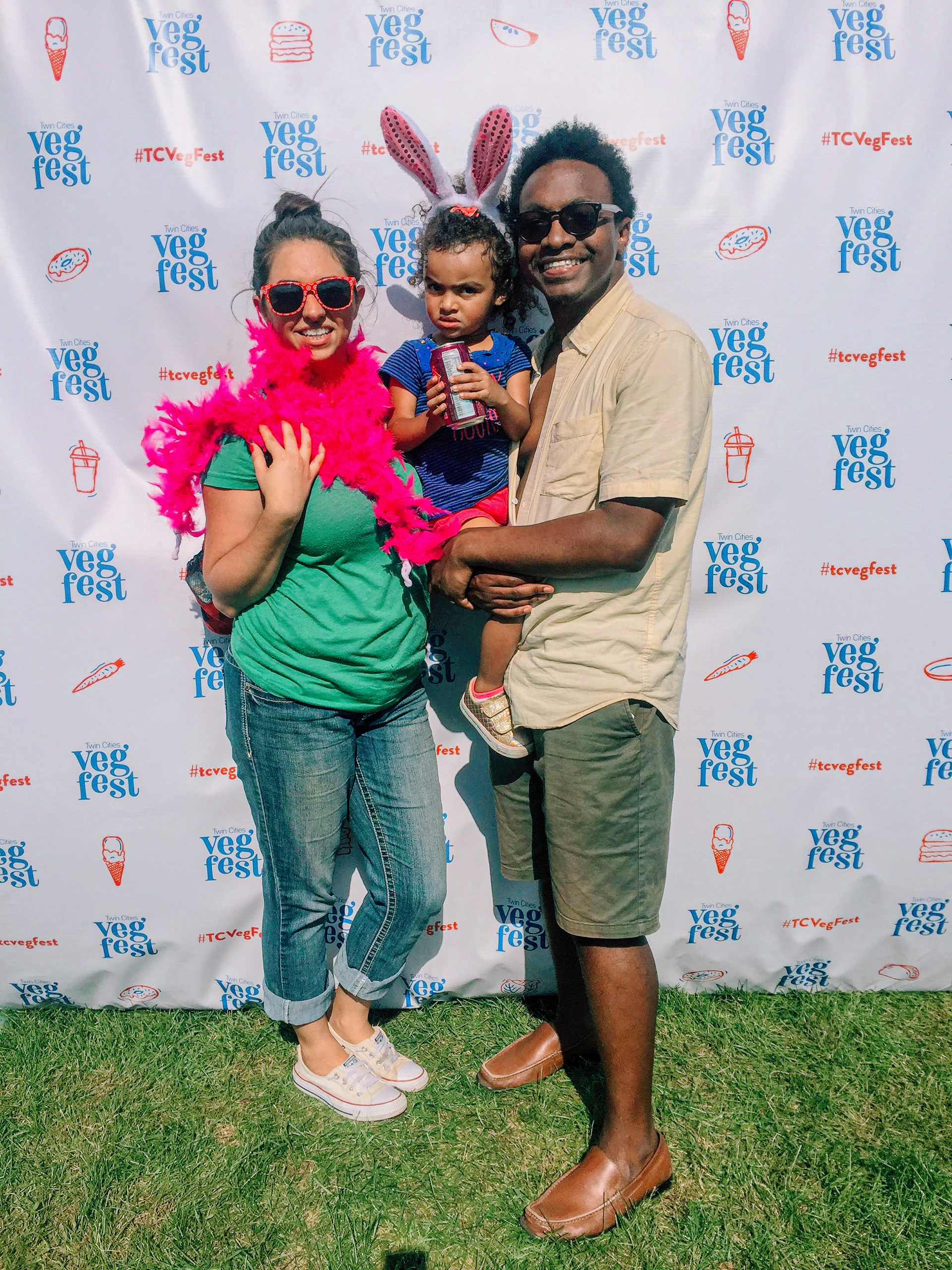
While researching, I noticed lots of green and orange colors and imagery of location, leaf, or food. Instead of zigging, I zagged to offer colors and iconography, unlike other veg fests through the U.S.
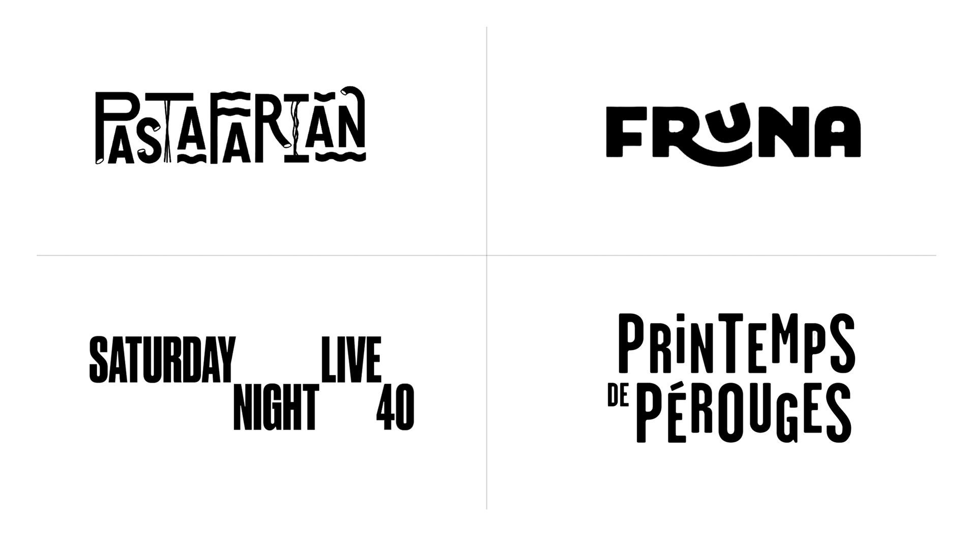
I explored offset typography for and custom hand-drawn illustrations to convey a sense of whimsicalness. The colors take their cue from the four primary food groups.

THE OUTCOME
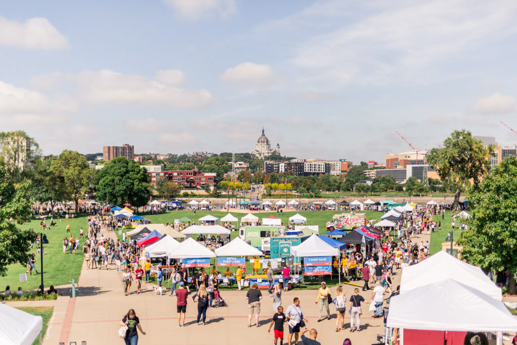
10,000 people experienced the new visuals
The year the rebrand launched was the biggest year (at that time) for the festival, drawing 10,000 people to Harriet Island Park in Saint Paul, MN. The previous year was 7,000; that’s a 30% increase.
Did my creative direction increase the attendance of all those new people? Probably not, but it did increase brand clarity for the festival, making it easier to understand what the event is, thus helping the festival welcome 3,000 more people.
Credits
Role: Strategist, Creative Director, Designer
Additional Illustrations: Ericka Wallis
Produced at: Freelance
Client: Compassionate Action for Animals